Do you like a home with character and personality? If so, you will love this new Beautiful Homes of Instagram!
I am truly honored to be featuring Abbie of @anaberdesign. Abbie is a San Diego-based interior designer and her home was recently featured in Domino and Apartment Therapy just to name a few. Yes, this interior designer is everywhere and it’s a name you will hear and see stamped on magazines in the future. I have no question about that.
Abbie’s California mid-century modern home feels artsy, comfortable and it has a story to tell… and she is sharing all of the details below.
“My husband, Malik and I bought in Spring of -2015 and closed on our wedding day! We were ecstatic about being able to afford a home in the area and knew that we’d have some work ahead in terms of updating the 1960’s original that we purchased. That was fine by us, as we both looked forward to renovating and making it a home that fit our style and taste.
I would say we were heavily influenced by mid century and a modern aesthetic from the start. We wanted our space to reflect Southern California lifestyle but without being too beachy. Tile and wallpaper of various patterns were used to add interest and our personal touch. Walls were kept crisp and white, which I’m a fan of. That to me, lends itself to versatility and the ability to switch things up in the future as well as allow for a clean palette.
In Spring of 2016, we added square footage to our home which included a breakfast nook and dining room. Previously, our outdoor space had been our dining area when we hosted for holidays. With the addition, we were able to entertain indoors yet still maintain and outdoor feel with our pocket door system. This addition came right in time for our daughter crawling. We used this dining space as a multipurpose space now. It’s perfect for her running around and chasing the dog. It’s amazing to see what 4 feet of space can do in the instance of the breakfast nook. By extending out 4 feet, we not only gained seating and a secondary eating area, but we also gained storage underneath the seating.
Our home has been a labor of love. We’ve customized it quite specifically to fit our lifestyle and design aesthetic. I would say that I’m a bit of a Style Mutt. My design aesthetic is influenced by modern, mid century, global, vintage, and bohemian styles. I feel that over time, my taste has evolved and merged. That can probably be credited to an over abundance of imagery readily available to us via social media. I also attribute it to an openness to not be so fixed on one specific style. I think you’ll find a lot of texture in our home. I love sticking with a neutral color palette and building layers of texture. I’m a bit shy of bold color pops, mainly because I worry about tiring of them.”
Beautiful Homes of Instagram: California Mid-century Modern
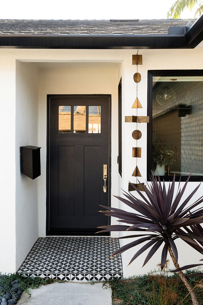
A new front door and a black and white cement tile, immediately updated the exterior of Abbie’s home.
Black Door Paint Color: Black Tie by Dunn Edwards.
Exterior Paint Color: White Picket Fence by Dunn Edwards.
Tile: Cle Tile – similar here.
Wind Chime: Anthropologie.
Home Size: 1,800 square feet.
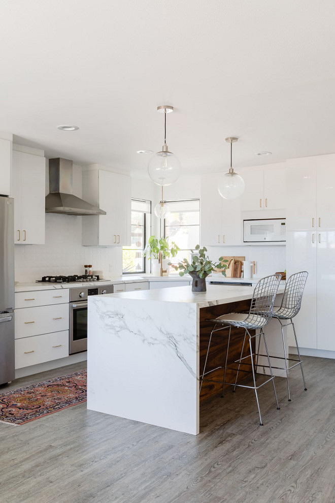
Kitchen
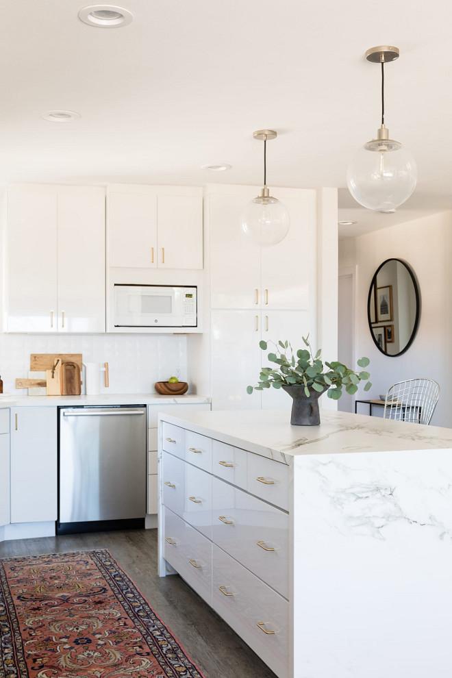
Our kitchen cabinetry is a white gloss thermofoil. We love the sleek and modern aesthetic for this space. Because the cabinets are super modern, we wanted to add some texture with the backsplash. We went with a textured porcelain by Constentino. I think it adds warmth without adding a patterned tile that we could easily bore of in here. We wanted the space to be relatively neutral as it is part of an open floor plan and is situated in the same space as the living room.
Paint: “Carrara by Dunn Edwards”
Backsplash Tile: Porcelanosa; Diamond White – Other Beautiful Tiles: here & here.
Appliances: Cooktop: Ancona. Oven: Ancona. Hood: Ancona. Fridge: LG.
Jennifer Siegwart Photography.
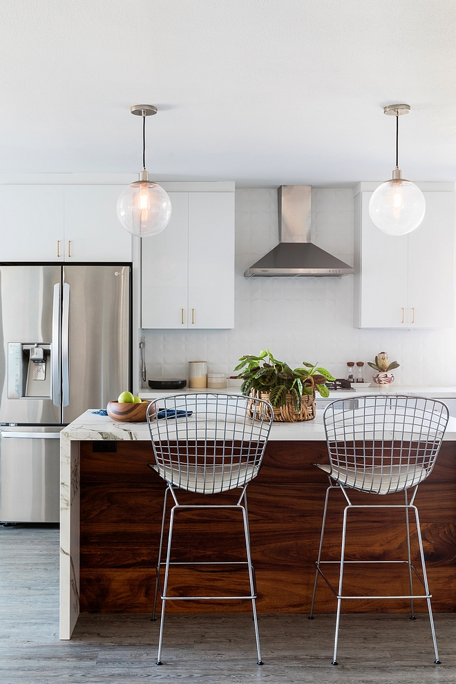
Kitchen Island
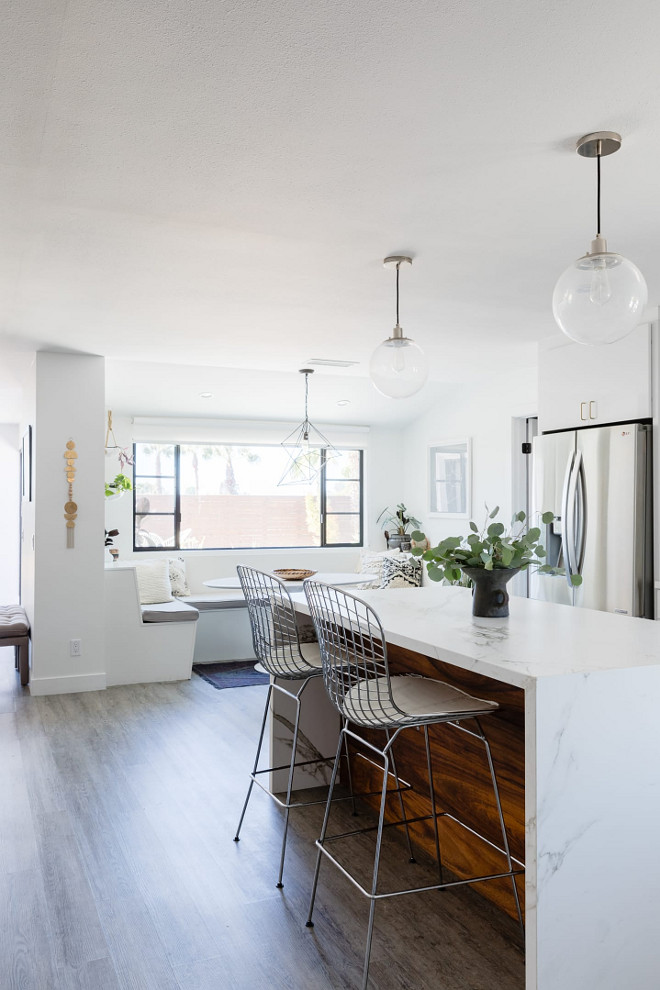
We used a material called Dekton for the countertops. It’s super durable and has the look of a marble but definitely not the feel or etching potential. We absolutely love it as a marble or quartz alternative. The island itself is also made from the Dekton “Aura”. We stained walnut for the wood paneling. I think it gives it a warm contrast of color and texture.
As for lighting, we used West Elm pendants with both polished nickel and champagne bronze as finishes.
Countertops: Dekton by Constentino; Aura.
Runner: Thrift store- Other Beautiful Runners: here, here, here, here, here, here, here, here & here.
Kitchen Faucet: Delta in Champagne Bronze.
Flooring: CORETEC 1 – similar here.
Jessica Isaac Photography.
Hardware
The cabinet hardware is a satin brass by Richelieu.
Kitchen Cabinets: High Gloss, Kraftmaid.
Jessica Isaac Photography.
Counterstools
Barstools are Bertoia Chrome Wire stools – similar here (easy to clean – perfect for homes with kids.  )
)
Faux Silver Dollar Eucalyptus: here & here.
Jessica Isaac Photography.
Breakfast Nook
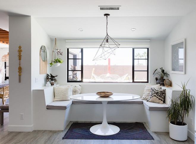
This space was part of our addition and adds so much in terms of functionality! We love sitting here and eating casual dinners. I also do a lot of my work in this space. I love the built in ledges on either side of the nook. They house a lot of greenery as well as fun vintage and global finds from the past few years.
Rug: West Elm
Lighting: Anthropologie.
White Ceramic Floor Planter: West Elm.
Pillows: Various- CB2, A Naber Design, The Garage Collective, Urban Outfitters.
Brass Wall Hanging: Vida and Luz.
Jessica Isaac Photography.
Hanging Planter
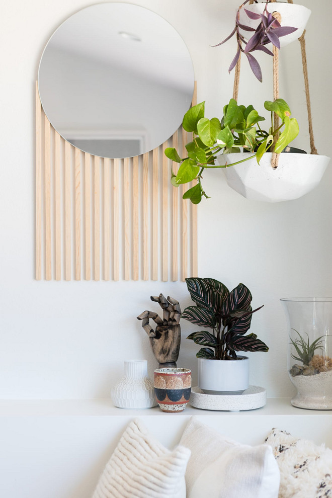
Hanging Planter: Urban Outfitters.
Mirror: Bohemian General.
Jessica Isaac Photography.
Dining Room
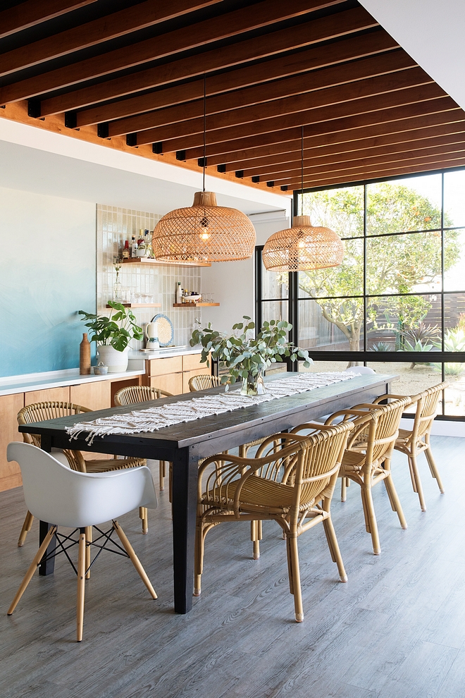
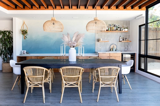
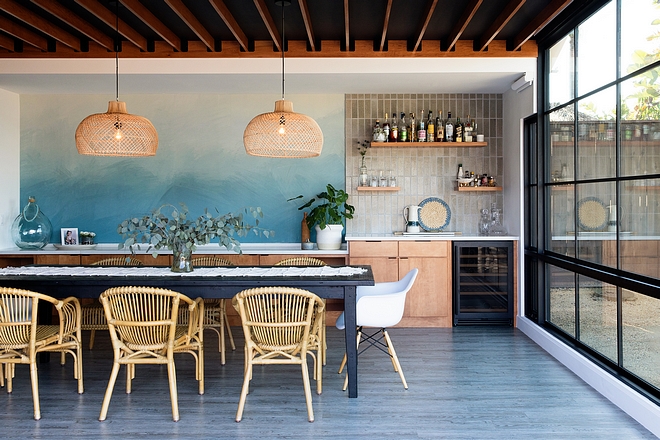
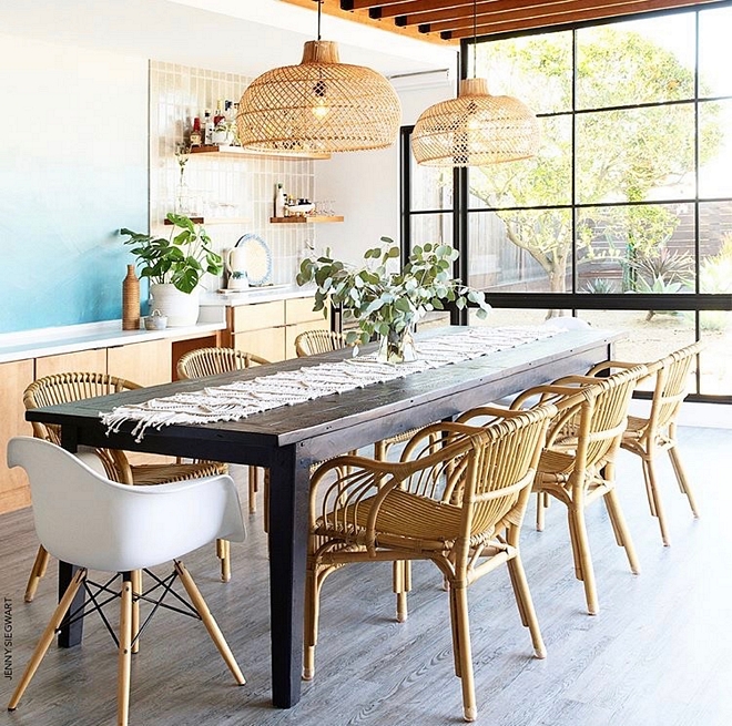
This space is the newest addition to our home. It was the best decision we could have made for additional square footage. Often times, “dining rooms” take on a stigma- think formal dining spaces of the 1980s’…. but this is certainly not the case with ours. We wanted the space to feel like a true indoor/outdoor room and not lose our view to the outside. It was our contractor’s idea to vault the ceiling so that the addition didn’t look like an addition but instead, part of the original home. We added wood planks and black metal brackets to modernize the ceiling. The windows are huge and truly bring the outdoors in.
Paint: “Carrara by Dunn Edwards”
Windows: Western Windows.
Macrame Table Runner (similar): here & here.
Jennifer Siegwart Photography.
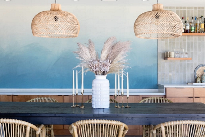
Mural
One of the first ideas I had for this space was the wallpaper mural for the wall. Decorating a wall of this size can be pricey with multiple pieces of art. Instead, we opted for a watercolor like mural which again ties in the outdoors.
Wallpaper Mural: Anewall Décor – other beautiful wallpapers: here.
Hanging Planter: Jungalow – similar here.
Jessica Isaac Photography.
Built-ins
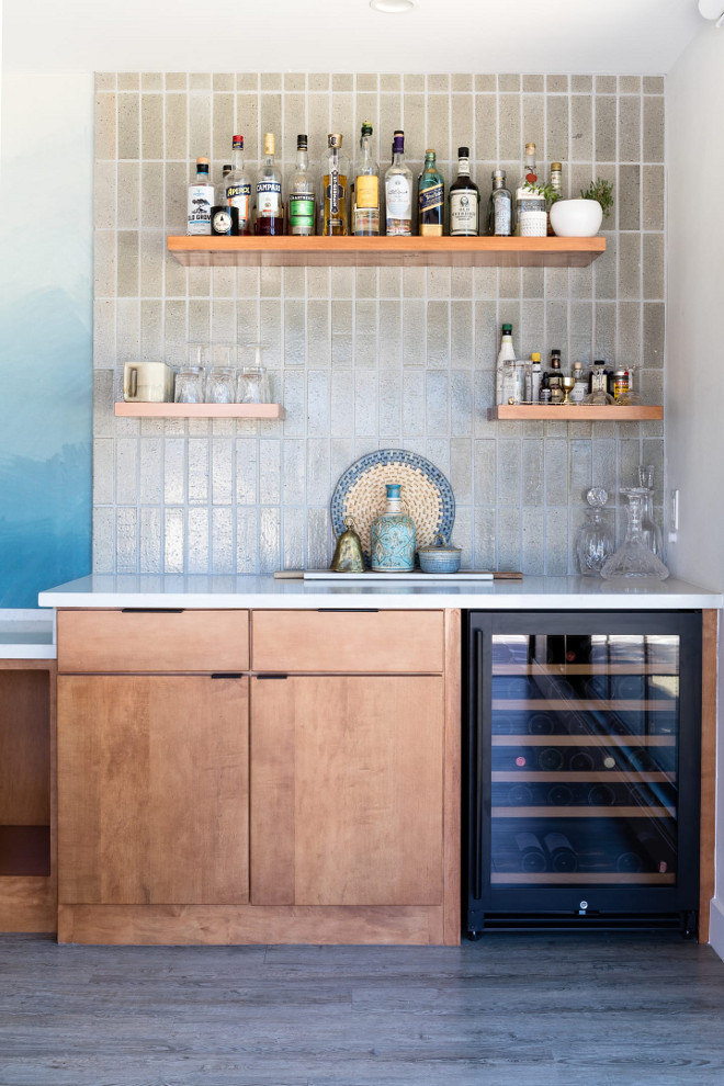
A must have item for this space was the bar. Ideally, my husband wanted a walk behind bar, but that wouldn’t work with our layout. We also added a ton of storage with our built in cabinetry.
Jennifer Siegwart Photography.
Dining Room Bar
Custom Built in Cabinetry: Kraftmaid.
Bar tile: Cle Tile – Other Similar Tiles: here, here, here, here & here (terracotta tile in white).
Jessica Isaac Photography.
Lighting
Lighting: Petite Lily Interiors – similar here, here, here & here.
Jessica Isaac Photography.
Dining Table & Chairs
Table: Restoration Hardware – Similar here – Others: here, here, here & here.
Side Chairs: Anthropologie.
Host Chairs: here – similar.
Jennifer Siegwart Photography.
Living Room
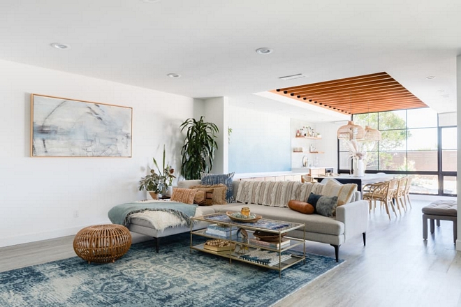
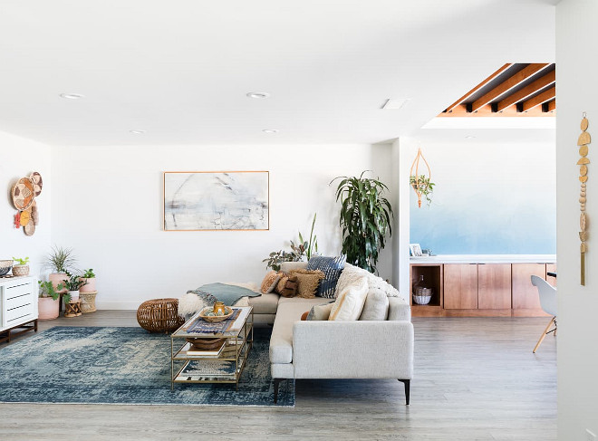
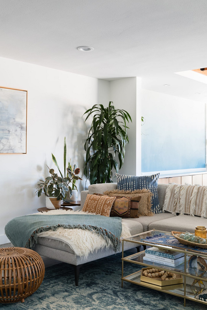
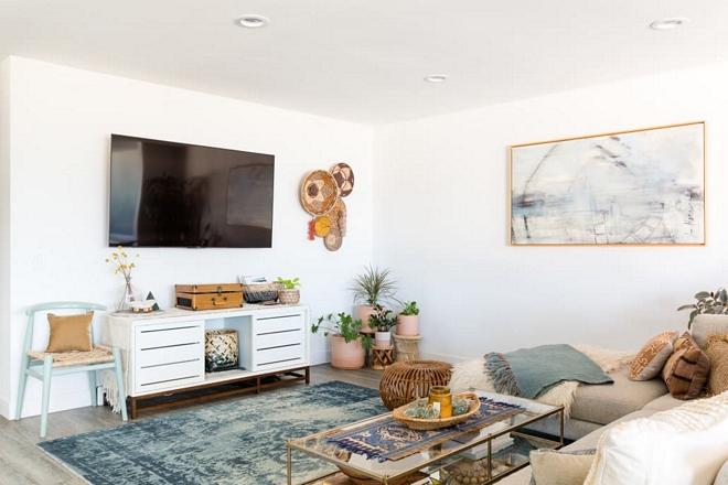
This room probably gets the most “wear and tear” in our home and is situated directly across from our kitchen. Prior to our addition, we had a 1960’s original wood paneled wall that acted as a cool accent wall. We sadly had to part once the addition was underway.
This space in our home is cozy, functional, yet also maintains a design forward aesthetic.
Couch: West Elm.
Jessica Isaac Photography.
Paint Color
I love to find unique items at the flea market and incorporate them into our spaces. You can find a lot of these pieces in our living area.
Paint: “Carrara by Dunn Edwards”
Rug:West Elm.
Painting:Pottery Barn.
Coffee Table: West Elm.
Jessica Isaac Photography.
Layers
I love layering textiles and patterns with the use of pillows and blankets as you can see here in the spaces.
Throws: Anthropologie & local store.
Side Table: West Elm.
Rattan Ottoman: here & here – similar.
Jessica Isaac Photography.
Home-Family-Home
This area is where our daughter spends a lot of time playing, so it also serves as a playroom of sorts.
Sideboard: CB2.
Jessica Isaac Photography.
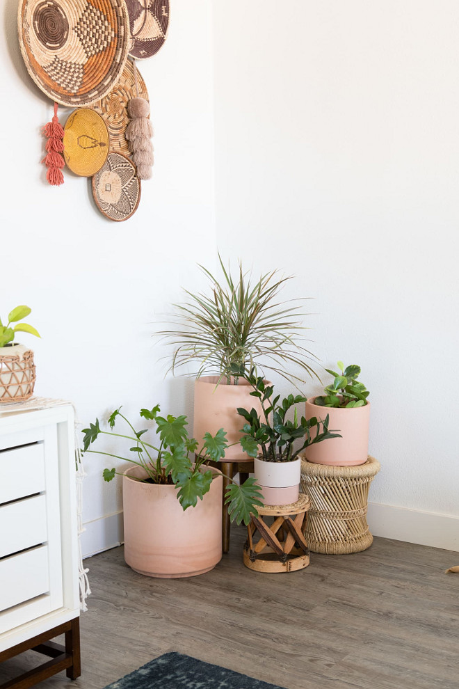
Planters
These earthenware planters are from Bohemian General and Urban Outfitters – similar here.
Jessica Isaac Photography.
Inviting
I absolutely love seeing homes that reflect the homeowner’s personality and the more I see Abbie’s home, the more I feel that she’s a person of vision.
Rug: Vintage
Jessica Isaac Photography.
Guest Bedroom
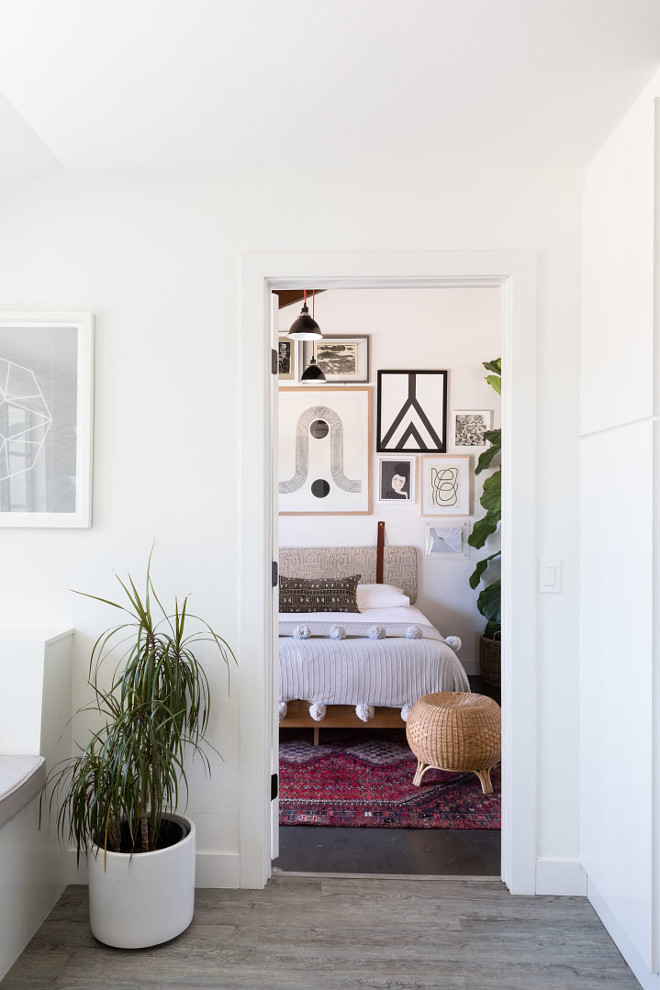
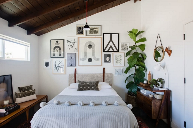
This space has a tall ceiling with wonderful afternoon sunlight. I had the idea to utilize as much vertical space as possible and create a curated black and white gallery wall. I spent time searching for modern/abstract black and white art. The search was so much fun, and I discovered so many new artists along the way. I wanted the wall to flow yet still be eclectic and not too matchy-matchy. I decided to matte some of the art and not others. I also wanted a mix of frames.
Art: various: Blockshop Textiles, Mel Remmers, Sofia Shu, Heather Marie Art, Benjamin Ewing, Samba to the Sea, Whitney Winkler, Kim Knoll, Mary Gaspar – similar here.
Bed Frame: Wayfair.
Headboard: Norwegian Wood – Other Beautiful Headboards: here.
Fiddle Tree: here– similar
Blanket: The Apollo Box
Pillows: a. Naber Design.
Lighting: Schoolhouse Electric
Jessica Isaac Photography.
White Bedroom Paint Color
Paint color is “Carrara by Dunn Edwards”
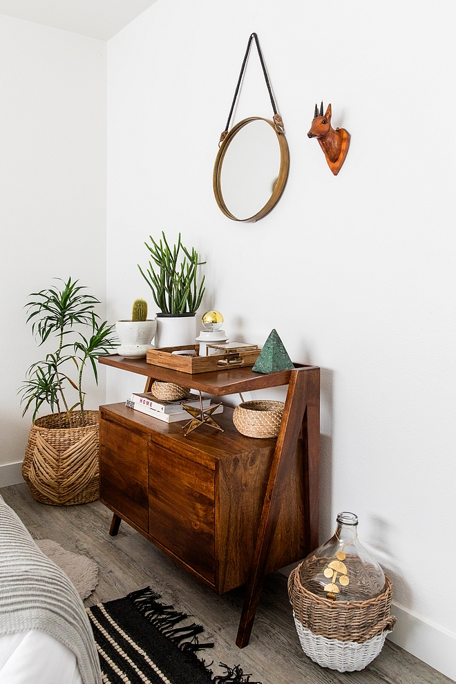
Hanging Mirror: Anthropologie.
Jennifer Siegwart Photography.
Guest Bathroom
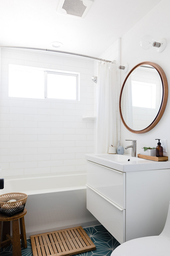
This space is such a mix of high and low. I knew I had to use the Dandelion tile from Marrakesh Design and base the rest of the room around this. Because this was a splurge, we used Ikea with the vanity and sink. I love the modern look of the Godmorgon model. This bathroom is tiny, but it packs a punch. Small spaces like this are great opportunities to splurge on a wallpaper or tile and be able to add a fun pattern without being too much.
Paint: “Carrara by Dunn Edwards”.
Tile: Marrakesh Design “Dandelion” – Similar: Starburst Hex Cement Tile.
Sink and Vanity: Ikea- Godmorgon model – similar here & here – This one is pricey, but I am loving it  : here.
Mirror: West Elm.
Lighting: Schoolhouse Electric.
Jessica Isaac Photography.
Nursery
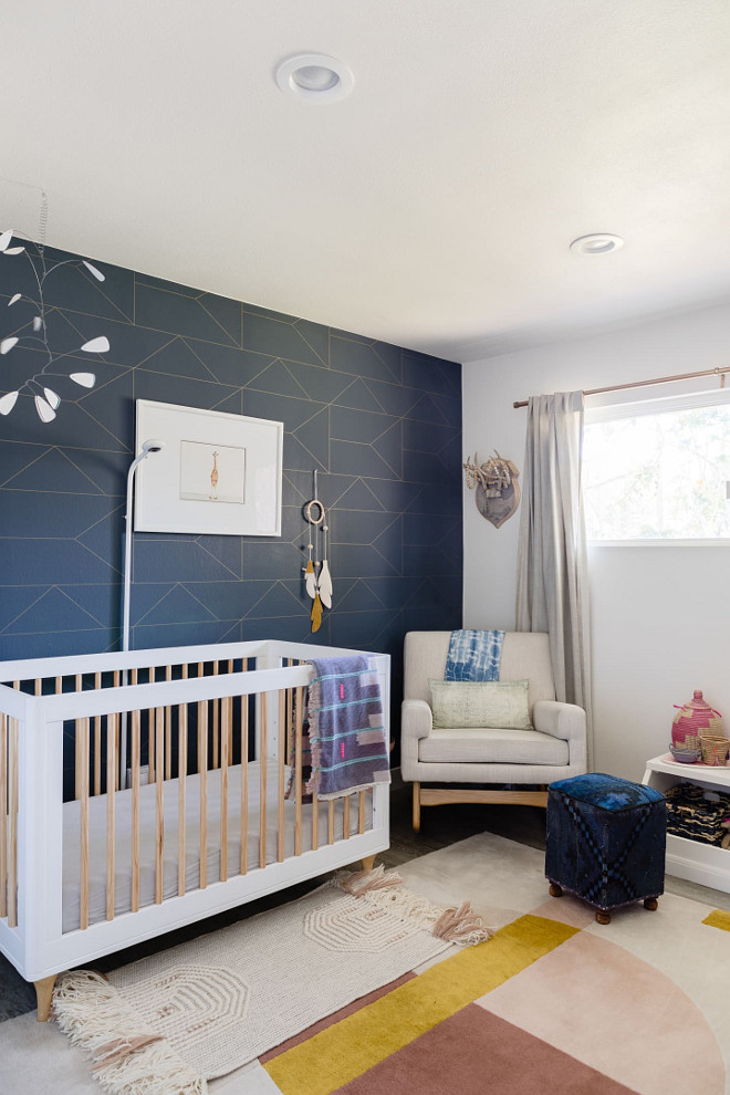
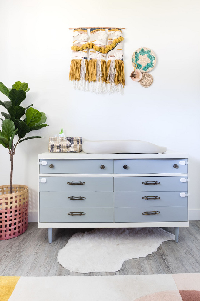
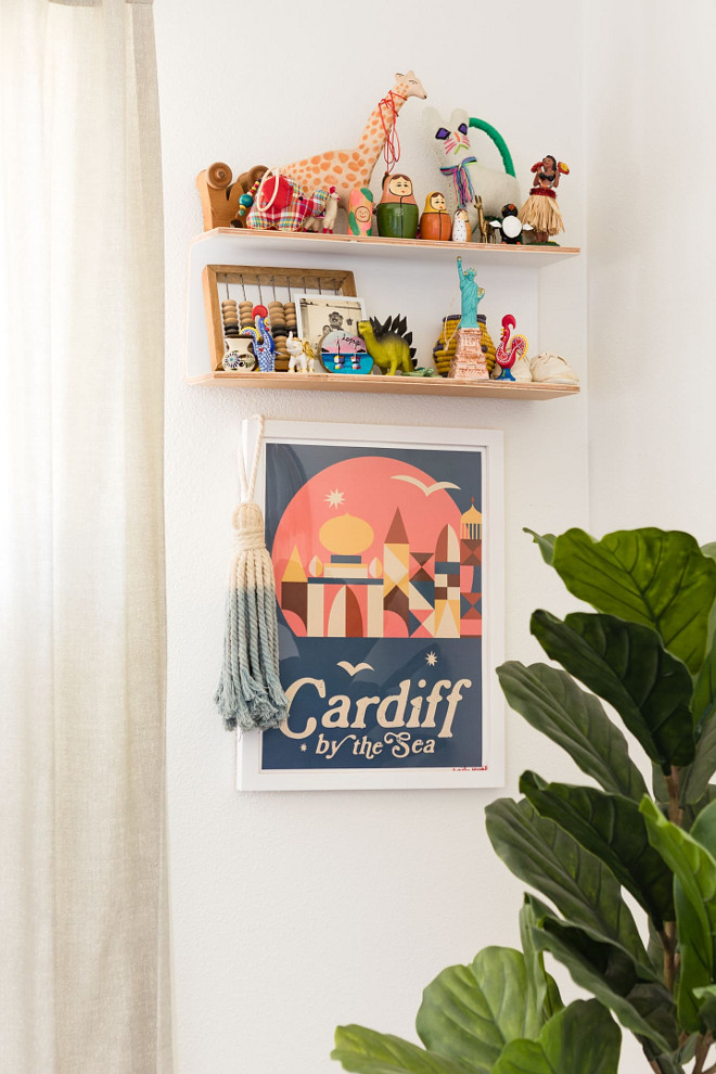
When I was pregnant with my daughter, I knew I wanted to create a space that was not too pink and not too girly. I knew that I would be spending a lot of time at night in there, so I wanted the color palette to be soothing. I also wanted the space to be something that she could grow into!
Wallpaper: Ferm Living – similar here.
Rug: West Elm.
Crib: Babyletto.
Giraffe artwork: The Animal Print Shop.
Glider: Nurseryworks.
Toy Bin: Land of Nod.
Curtains: West Elm.
Jessica Isaac Photography.
Dresser
Dresser: Vintage
Jessica Isaac Photography.
Shelves
Shelves: Urban Outfitters.
Jessica Isaac Photography.
Master Bedroom
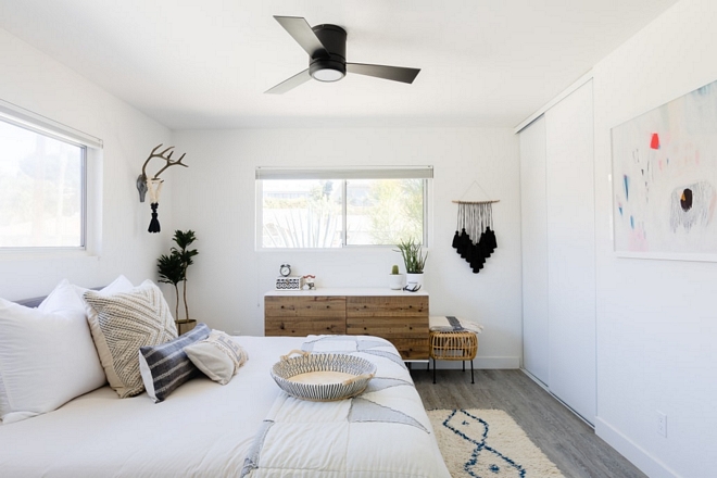
This space is light, bright, and due to the size, we keep things pretty simple in here. It’s a calming space for me and is ruled by white and blue tones like most of our house!
Paint: “Carrara by Dunn Edwards”
Dresser: West Elm.
Bed: West Elm.
Bedding: Wonderhome NYC and West Elm – (West Elm has one of my favorite bedding! Great quality & value).
Pillows: a. Naber Design.
Rug: Vintage.
Ottoman: Target.
Jessica Isaac Photography.
Master Bathroom
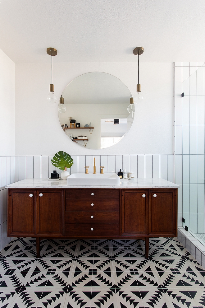
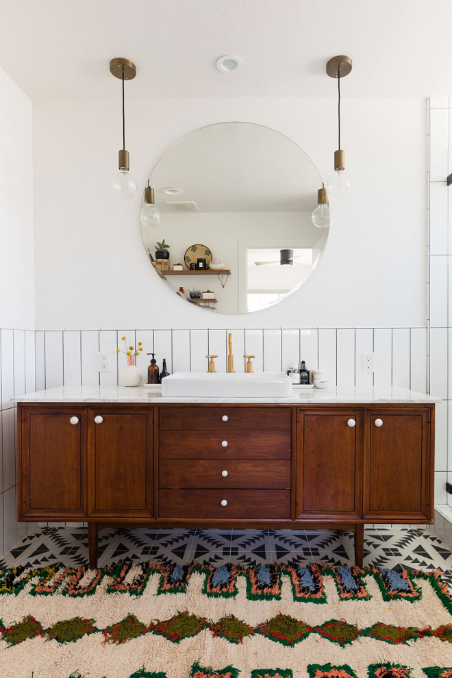
This could be my favorite space in our home. The space started with the idea of incorporating the Tulum tile. We were having a hard time finding a prefab vanity that we liked, so we searched on Etsy for a Mid Century credenza to convert. Staying mostly black and white allowed us to play with pattern and shapes. I think the wood vanity warms up the space.
Tile: Tulum – Cement Tile Shop – similar here.
Vanity: Etsy – one-of-a-kind.
Jennifer Siegwart Photography.
Bathroom Sources
Lighting:Schoolhouse Electric
Sink: Kohler Vox
Mirror: here – similar
Rug: June and Blue – similar here, here, here, here & here.
Jessica Isaac Photography.
Landscaping
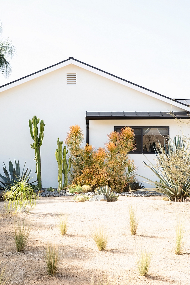
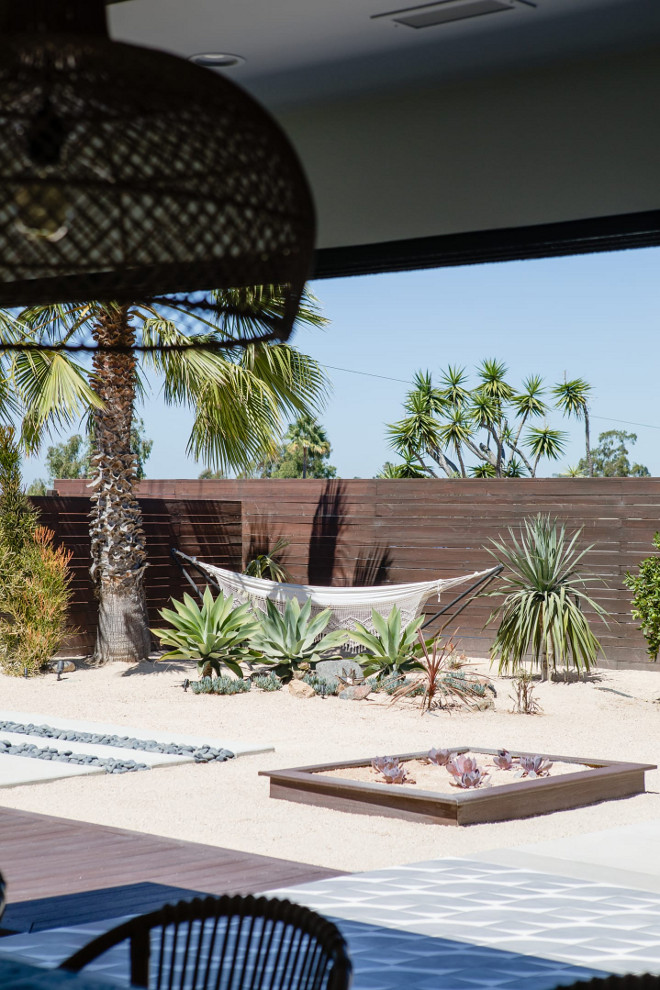
The reality is, grass lawns are expensive and don’t make sense with the state of drought we are in. When we moved in, the grass lawn was a sorry sight. We knew that we needed to convert our exterior to a drought tolerant landscape. With a lot of Pinterest searching and a love for Palm Springs landscaping, we brainstormed to create a low maintenance outdoor space. I am by no means a landscape designer, but I was able to draw and create some imagery for our landscaper. We now have decomposed granite as our lawn!
Jennifer Siegwart Photography.
Outdoor Fireplace
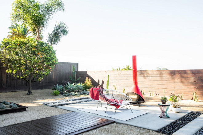
One of my favorite pieces in our outdoor space would have to be the vintage Malm fireplace that we scored off of Craigslist. I had my eye on them for quite some time. This one popped up in our vicinity. With a bit of TLC, it was as good as new!
Outdoor Loveseat: here – similar
Outdoor Rug: Lulu and Georgia.
Outdoor side table: CB2.
Outdoor Fireplace: Malm Outdoor Fireplace, Craigslist.
Jessica Isaac Photography.
Patio Door
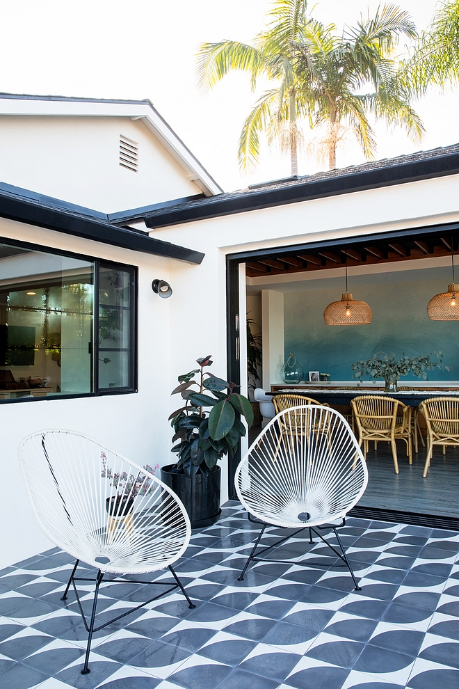
We love our pocket door system from Western Windows and Doors. The windows can fold back completely into the wall which is perfect for the summer time.
Jennifer Siegwart Photography.
Patio Tile
Patio Tile: Cle Tile: “Arc”.
Acapulco Style Chairs: similar here.
Jennifer Siegwart Photography.
Hello, Sunshine
Outdoor Hammock: Anthropologie.
Jessica Isaac Photography.
I profoundly thank Abbie for opening the doors of her beautiful home to us. Make sure to follow Abbie on Instagram and visit her website see more of her beautiful home and work!
Photo Credit: Jess Isaac and Jennifer Siegwart.
Home Bunch Favorites:
Amazing End-of-Season Sales!
Thank you for shopping through Home Bunch. I would be happy to assist you if you have any questions or are looking for something in particular. Feel free to contact me and always make sure to check dimensions before ordering. Happy shopping!
Serena & Lily: Tent Sale Up to 70% off! – Enjoy an Extra 20% OFF. Use Code HOORAY
Wayfair: UP to 75% OFF – Huge Sales on Decor, Furniture & Rugs!!!
Joss & Main: Best Prices of 2018 – Up to 70% Off
Pottery Barn: Buy More, Save More – 20% Off Sidewide + Free shipping: use Code: HELLO19
One Kings Lane: Final Days to Save: Take an Extra 20% Off Markdowns with Code OKL20MORE.
West Elm: Big New Year Sale: 20% Off Your Entire Purchase! Use Code: NEWYEAR
Pier 1: Huge Sales – Up to 60% Off!
Horchow: High Quality Furniture and Decor. Up to 55% Off!!!
Anthropologie: Winter Tag Sale: All sales at an extra 40% Off! Amazing!
Build: Bathroom Renovation Sale – Save up to 65%
Posts of the Week:
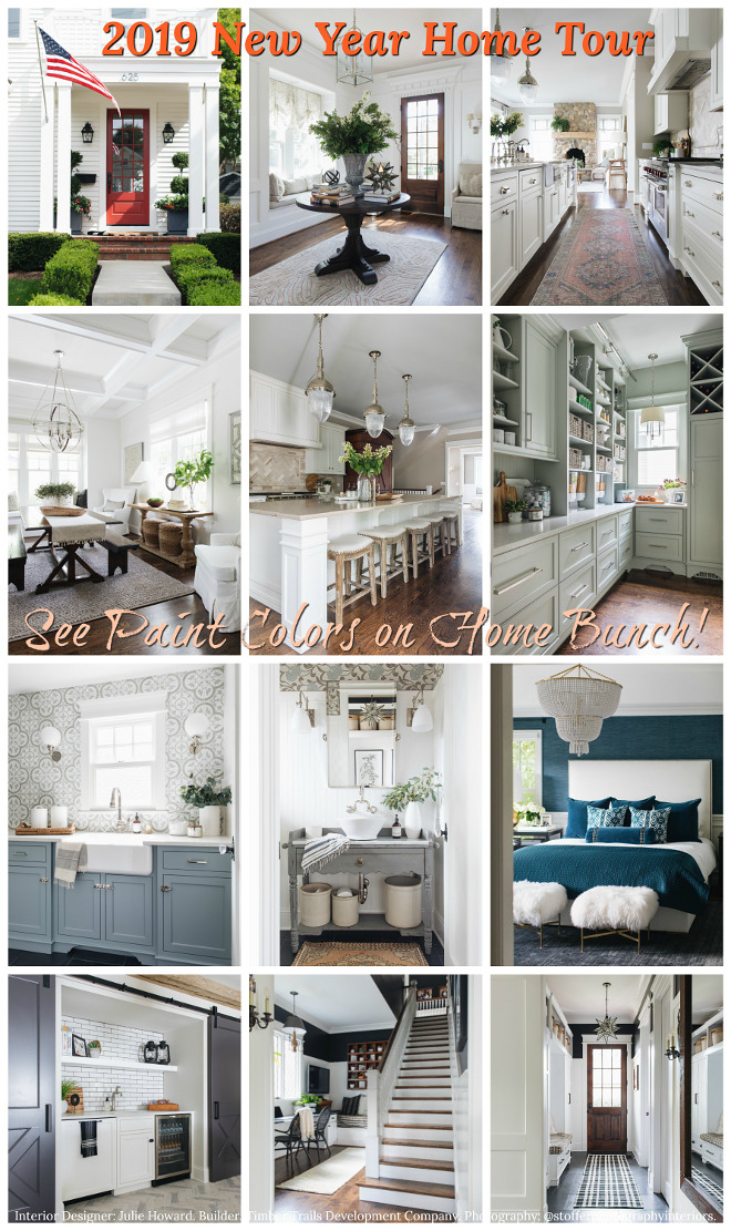
2019 New Year Home Tour.
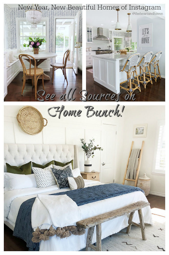
New Year, New Beautiful Homes of Instagram.
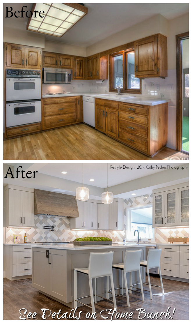
Before & After Home Renovation.
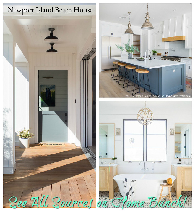
 Newport Island Beach House.
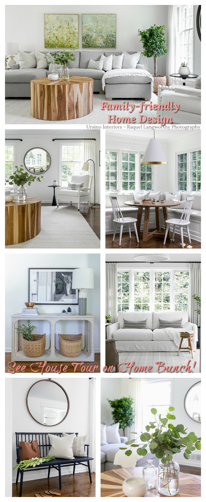
 Family-friendly Home Design.
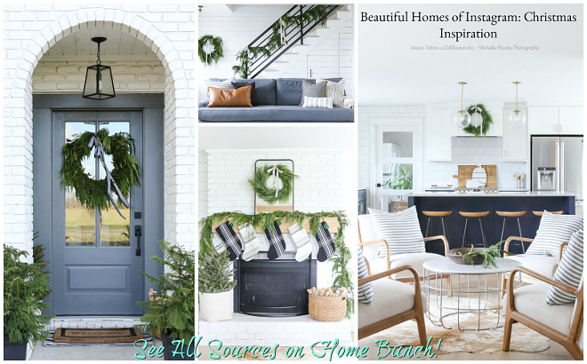
Christmas Inspiration.
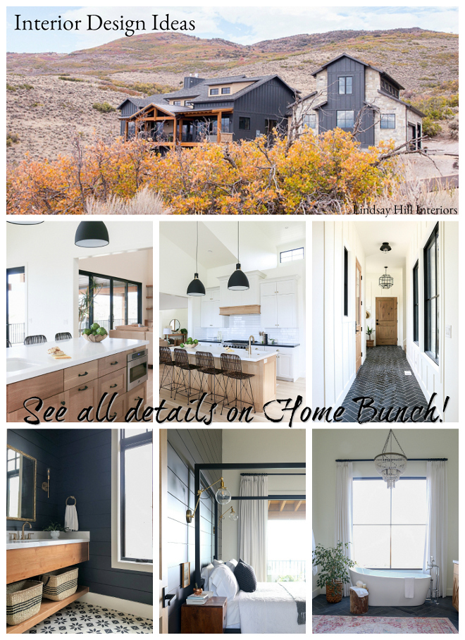
Interior Design Ideas.
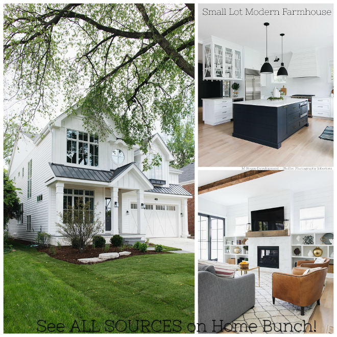
 Small Lot Modern Farmhouse.
 Transitional Home Design.
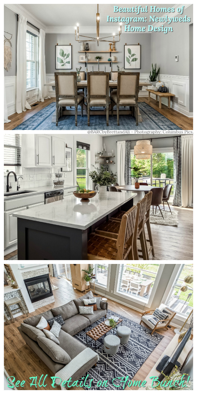
 Newlyweds Home Design.
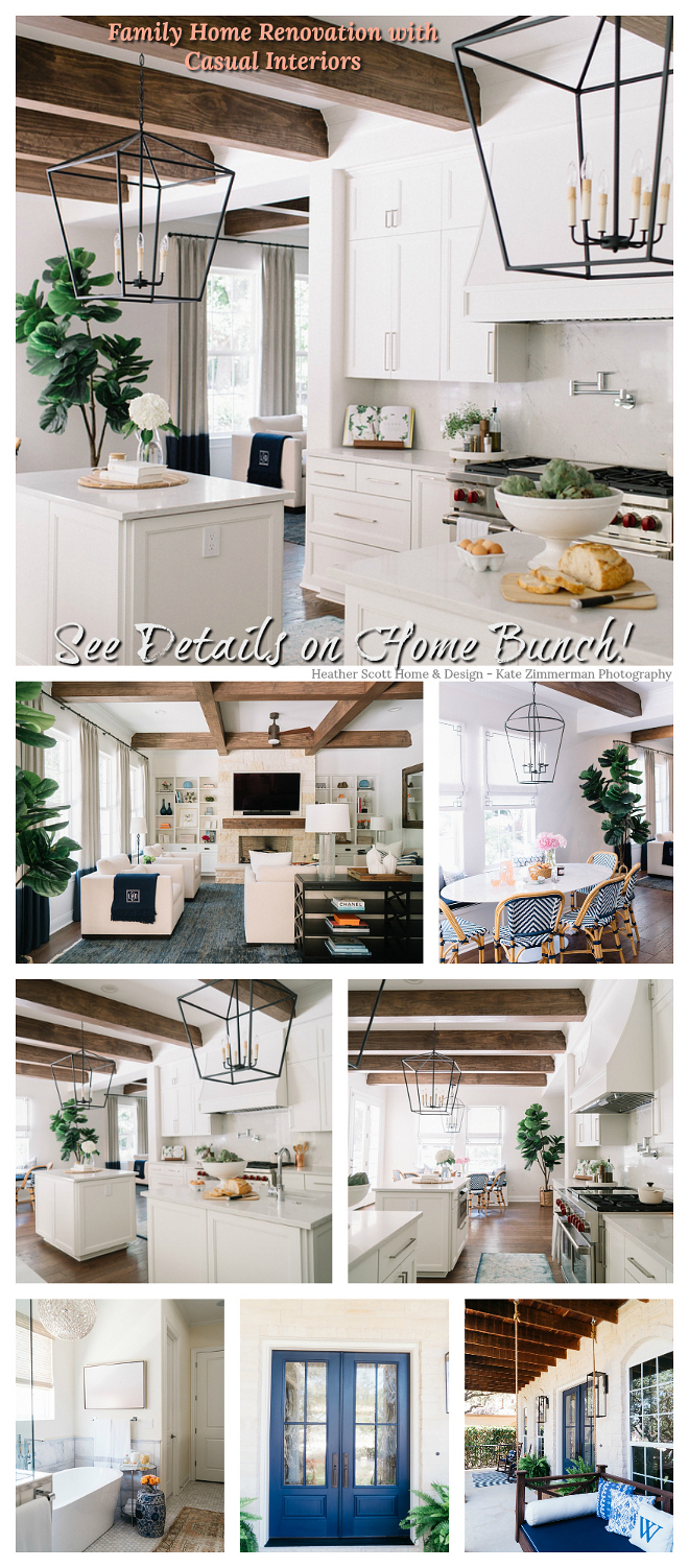
 Family Home Renovation with Casual Interiors.
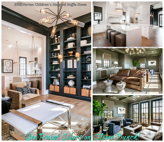
2018 Norton Children’s Hospital Raffle Home.
Beautiful Homes of Instagram: California Beach House.
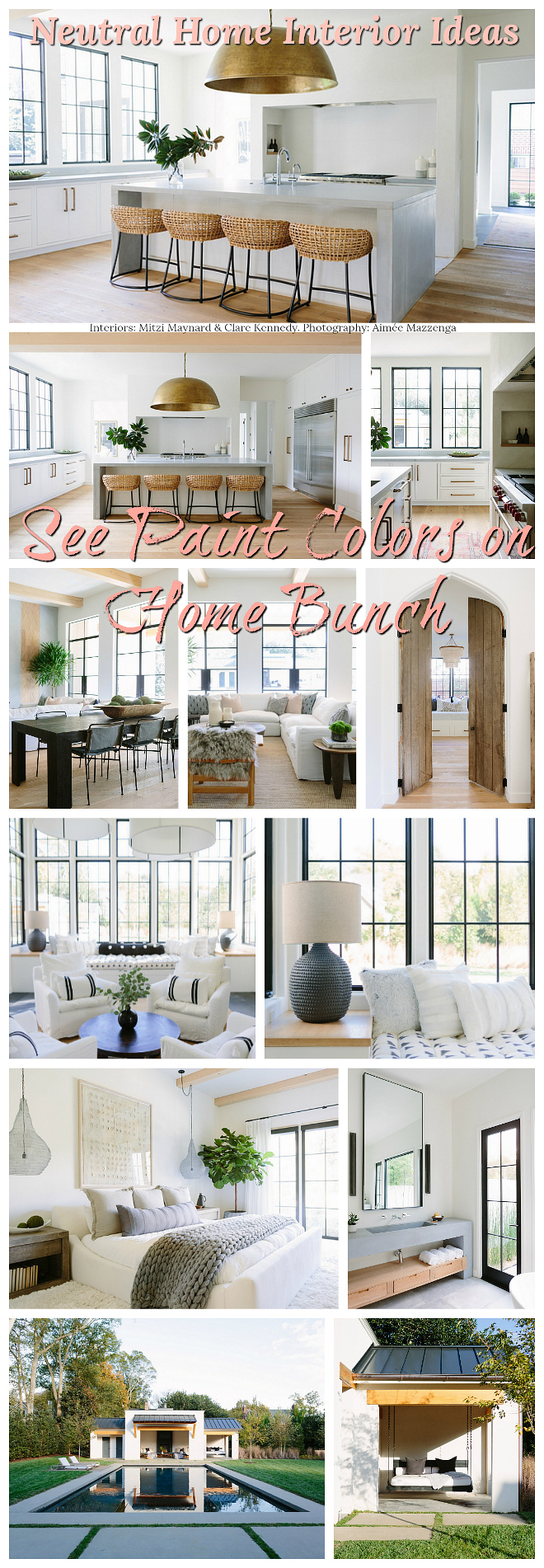
Neutral Home Interior Ideas.
You can follow my pins here: Pinterest/HomeBunch
See more Inspiring Interior Design Ideas in my Archives.
“Dear God,
If I am wrong, right me. If I am lost, guide me. If I start to give-up, keep me going.
Lead me in Light and Love”.
Have a wonderful day, my friends and we’ll talk again tomorrow.”
with Love,
Luciane from HomeBunch.com
Get Home Bunch Posts Via Email
“For your shopping convenience, this post might contain links to retailers where you can purchase the products (or similar) featured. I make a small commission if you use these links to make your purchase so thank you for your support!”
Via Interior http://www.rssmix.com/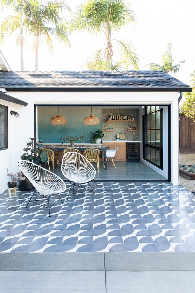

No comments:
Post a Comment